
Are Options Right for You?
Many investors use options strategies while other investors avoid options because they believe options carry high risks. The truth is that all investments carry risk whether the investor is buying stocks, bonds, real estate, options or other assets.
But, there are some differences in the level of risk for each asset. For options, the risk can be managed in ways that are unique.
Managing Risk
Many investors are familiar with risk management in the stock market. Some may buy a stock and immediately place a stop loss order to manage the risk of the position. But, the stop loss order will not limit risk precisely. The chart of Twitter (NYSE: TWTR) provides an example.
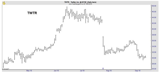
In July, the stock traded in a narrow range as traders waited for the next earnings report. Much of the price action was between $42 and $46 a share. Consider an investor who bought the stock at $44. They may have decided to risk 10% and set a stop loss at $40.
When earnings were announced, the stock opened at $37.25. That would have triggered the stop loss and the order would have been executed shortly after that. The trade might have been executed at $37, a loss of about 16% which is more than intended. In dollar terms, the loss was $6.75 instead of $4 per share.
Instead of a simple stop loss order, the trader could have added a limit price to the order. Perhaps the order would have been a limit of $40 which means the sell has to be executed at $40 or higher. That order would not have triggered and the trader would now be holding the stock at about $30, a loss of about 32%, or $14 per share.
This example illustrates that when there is a gap down, the limit order will not allow for precise risk management. A gap occurs when prices open below the previous day’s low and are fairly common although gaps as big as the one seen in TWTR are less common.
Using Options to Manage Risk
Now, instead of buying the stock, the trader could have used a simple options strategy. In this case, the trader could buy a call option. Before turning to the specifics, we will look at exactly what a call option is.
A call option gives the buyer the right to buy 100 shares of a stock at a predetermined price at any time before a predetermined date. The price and date are determined before the trade is opened so that options buyers know exactly what they are buying.
Note that the call buyer has the right to buy the stock. They do not have an obligation to buy. That means that there is a limited amount of risk in the trade. If the price does not behave as expected, the option’s value will drop to zero. In that case, the trader would lose what they paid for the call.
Options generally trade at low prices. In the middle of July, for example, the TWTR August 17 $44 call was trading at about $3.35.
This call gave the buyer the right to buy 100 shares at $44 until August 17 and costs $335, or 100 times the quoted price of $3.35.
Now, assume TWTR moved higher after the earning report. If the stock jumped to $48, the option would be worth at least $4. This is because the trader could exercise the option, buying 100 shares of TWTR at $44, and immediately sell them at $48, realizing a gain of $4 per share.
This would be a gain of $0.65 or 19.4%, much more than the 9% gain in the stock price.
But, we know that TWTR didn’t rise. The price fell. This meant the option became worthless. That’s because the trader could still exercise the option at $44 but would be selling at $37 or less. In this case, exercising the option would result in a loss rather than a gain.
Since that would be irrational and no trader would exercise an option at a loss, the option has zero value. That means the maximum loss on the trade is $3.35 in this example. Note that this is less than the value at risk with the 10% stop loss order in the example of buying the stock shown above.
Unlimited Rewards and Limited Risk
In this case, and in many others, the call option provided better risk management tools than owning the stock. This does not mean that buying calls is always the best choice. Remember that a call option has an expiration date and provides exposure to the stock for only a limited time.
However, before the call expires, the rewards mirror those of owning a stock and carries limited risk. This is illustrated in the diagram below.
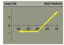
Source: Options Industry Council
In this article, we have focused on just one option strategy, buying a call. There are other strategies, including buying a put option. Puts give the buyer the right to sell 100 shares of stock at a predetermined price for a predetermined amount of time. A put increases in value as the price of the underlying stock does.
Traders can also sell options but selling an option does carry more risk than buying an option. The risk and rewards of selling a put option are shown in the next figure.
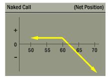
Source: Options Industry Council
Notice that when selling a call, the rewards are capped and the risks are now, in theory unlimited. Other strategies can be used to limit the risks when selling a call option while still enjoying some of the benefits of selling the option.
These are the simplest options strategies and there are more complex strategies. However, the complexity varies and few, if any, of the strategies will be beyond the ability of the typical individual investor.
We will be detailing other strategies in additional articles, highlighting the potential benefits of options to manage risk and to pursue returns. Because options have an expiration date, many strategies are suitable for short term trading and could be beneficial to small traders looking for income.


