Uncategorized

Individuals Can Benefit from Quant Investing

investing tools

Among the biggest ideas in investing right now is the concept of quantitative investing. It’s not really a new investing strategy but it is a newer approach to investing that relies on tools that weren’t widely available to individual investors until recently.

Quant investors use computer screening to find investment ideas. They might use a database to screen for stocks with low price to earnings (P/E) ratios. Professional investors have had these tools for decades and many have put the tools to good use.

Consider James Simons, an investor who may not be as well know as Warren Buffett but who has a track record that might be even more impressive that Buffett’s.

After graduating from MIT, Simons worked as a cryptographer cracking codes for the Department of Defense during the Vietnam War. After that, he taught math at MIT and Harvard.

He worked with other researchers to develop a theorem for differential geometry that’s called the Chern-Simons forms. Experts say it is an important tool for theoretical physicists working to identify the smallest forces in the universe.

In 1982, Simons left academia and decided to apply his math skills to the financial markets. He founded Renaissance Technologies, a hedge fund group that uses complex math tools to take advantage of inefficiencies in futures, currencies, and the stock market.

His firm now employs more than 300 professionals, many with PhDs in math and science. His benchmark fund, the Medallion Fund delivered annual returns of 35.6% at a time when the S&P 500 gained an average of 9.2% a year over twenty years.

That return is after fees and Renaissance charges what might be the highest fees in the industry. The firm charges a management fee of 5% a year and also takes 44% of the gains above a benchmark. Typically, a hedge fund charges less than 2% a year and retains 20% of gains above the benchmark.

Simons might be the best quantitative investment manager in the world.

Unlocking Quant Analysis

Many investors focus on fundamental analysis, technical analysis or a combination of the two.

Fundamental analysts will sort through a company’s income statement, its balance sheet, and the company’s statement of cash flows, adjusting the reported numbers as appropriate to develop the values needed to complete a discounted cash flow analysis to determine the company’s value.

Technical analysts review price charts in search of patterns and study indicators designed to show the direction of the trend or highlight potential reversals in the trend.

A quantitative approach to investing relies on computers to identify characteristics of successful stocks. Based on historical performance of that factor, the investor buys all stocks that meet the defined criteria and sells when predefined sell rules are met.

Quants often use the computer output to drive all decisions. They may not supplement that output with any other analysis. This has provided success and outsized returns to some investment managers.

But, for many years it requires data and programming skills to find stocks with a quant strategy. Now, those tools are available to individual investors and some tools to implement quant strategies are even available for free.

A Free Quant Screening Tool

One way to find stocks meeting a variety of predefined requirements is with the free stock screening tool available at FinViz.com. At this site, you could screen for a variety of fundamental factors like free cash flow, high levels of institutional ownership and bullish institutional transactions.

The site also allows investors to screen for a variety of technical factors. We can quickly work through an example to demonstrate how this tool could be applied. The screen below shows all of the available filters.
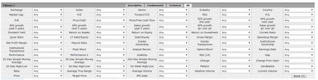
FINVIZ screening tool

Source: FinViz.com

There were 7,446 stocks in the database on a recent day. We want to search for just a few that could be good investments. We will combine fundamentals and technical data in a search for the right stock (fundamentals) at the right time (technicals).

To ensure the stock is tradable at a reasonable cost, even in a market crash, we will limit the search using market cap selecting just the largest which are labeled “mega cap.” All selections are made with pull down menus as shown below.
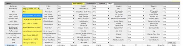
stock selection tool

Source: FinViz.com

That reduced our potential buys to just 33 stocks. The screen updates with each selection so that you know whether or not a criteria is too restrictive or not restrictive enough. To increase the potential buys, we will change this selection to “+large” cap stocks, those with a market cap of $10 billion or more.

We now have 718 stocks in our screen. For a fundamental factor, we will use “price / free cash flow.” Some studies have shown this an excellent predictor of future stock market performance. Any criteria could be used depending on your preference.

Selecting a low P/FCF ratio, defined by FinViz as less than 15, left 90 stocks in our screen. Now we want to add a technical filter. For this, we want to focus on “buying dips” which can be defined as stocks in long term up trends but short term down trends.

The criteria for FinViz is that the stock be above its 200-day moving average, a long term up trend, but below its 20- day moving average, and a short term down trend.

These criteria are shown in the next chart.
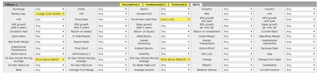
stock selection criteria

Source: FinViz.com

This left us with 17 stocks, enough for a diversified portfolio. The screen could be rerun once a month, rebalancing the portfolio based on the most current data.

Alternatively, a screen could be constructed of purely technical criteria or based solely on fundamentals. Quant investing can be adapted to your personal investment style preferences and to your desired criteria to define expected levels of risk.

This is an adaptable tool which has been proven to deliver superior performance in the hands of some managers. For individual investors, an added benefit is that quant investing imposes discipline with strict buy and sell rules needed and a plan for action in bull and bear markets.


Uncategorized

The Fourth Quarter Could Be the Best of the Year

fourth quarter

If you ask children about their favorite times of the year, their answers will generally be either their birthday, the summer break from school, Halloween or Christmas. Those might be the most important times of a year in the life of a child.

As we grow older, many of us still place a high value on those times of the year. In everyday living, we expect certain seasonal patterns to unfold every year. In the fourth quarter of the year, we expect Halloween to give way to Thanksgiving and then Christmas.

It’s human nature to expect this level of predictability to be seen in the stock market simply because we like to see some sense of order in the chaos of the market action. The result of this is popular strategies like “sell in May and go away.”

Testing has shown that you can achieve almost all of the market gains and avoid the periods of greatest risk by selling at the beginning of May and staying out of the market for the next six months. That means the time to buy is the beginning of November.

This is just one of the seasonal trading strategies we find in the last three months of the year.

Autumn Crashes Were Once a Logical Part of Life

Seasonal strategies are an effort to make sense based on the calendar out of the chaos of the markets. Many of these strategies were developed by noting that certain events, like market crashes, tend to occur at the same time of the year.

Many investors know about stock market crashes in October 1987 and October 1929. By selling in May, investors avoided these crashes. For those who aren’t familiar with October 1987, the chart is shown below.

DOW Jones daily chart

But this strategy also avoided the bear market that unfolded in the summer of 1991 and the 36% decline in the panic of 1907 along with steep selloffs in the Panic of 1857 and the Panic of 1837.

Those early crashes were almost predictable. Before the Federal Reserve was created in 1913, panics were fairly common in the fall. Without a central bank, money supply moved across the country in response to demand.

In the fall, demand was usually the greatest in the western states where farmers were bringing in crops. Cash was needed to pay for the crops and the cash was often used to pay off loans to banks which then shipped the cash back east.

With physical cash in short supply in eastern cities, including New York where the stock exchange was located, panics were relatively common in the fall. 

There were, of course, other factors and that explains why there were panics in some years and not in others but there was a logical explanation for why selling in May made sense.

But, now those six worst months are nearing an end. In fact, there’s a reason to consider buying before the end of that period.

The Best Quarter for Stocks

One reason to consider being more aggressive in the fourth quarter is the fourth quarter rally, a tendency for stocks to perform best in these three months. Data for the S&P 500 index since 1928 is shown in the chart below.

fourth quarter rally

The index shows a gain 74% of the time in the fourth quarter, far better than the results seen in any other quarter.

Small caps could be the best trade for the fourth quarter rally. The chart below shows the performance of the IWM ETF by quarter. The results for the fourth quarter are even more consistently profitable than they were in the S&P 500. This chart shows the results since 2000 when the ETF began trading.

performance of the IWM ETF by quarter

Seasonal strategies in the fourth quarter also include a number of short-term trades.

The Santa Claus rally is the name of a strategy that takes advantage of the tendency of stocks to rise in the week between Christmas and New Year’s Day.

Buying and holding stocks for the last five trading days of the year and the first two trading days after New Year’s has been a winner 75% of the time with an average gain of 1.4% for the seven days.

The performance in Christmas week is well above average. In an average week, the stock market shows a gain about 55% of the time and the average gain is less than 0.25%.

Less well known is the “turkey trade.” The S&P 500 gains an average of 0.64% during Thanksgiving week, buying at the open the Monday before Thanksgiving and selling at the close the Friday after the holiday. The trade has been a winner 67% of the time.

Finally, we have a more complex set of trading rules for traders to consider. Studies have shown that stocks setting new 52-week lows in December tend to outperform the market for the first six weeks of the new year.

Stocks making new lows in December could be the stocks investors are selling to generate tax losses. Buying these stocks sets up a potential win when investors buy the stocks back after the 30-day waiting period required by tax rules.

The specific rules for this strategy are to buy stocks making new 52-week lows the Friday before Christmas. If there are too many stocks to buy, select the 5 or 10 stocks with the largest loss over the past year.

Hold these stocks until February 15 and sell at the close that day. On average, this strategy has delivered a gain of more than 12% a year since 1974.

Many traders use seasonal strategies to boost their profits. The strategy can be as simple as tilting to a more aggressive investment posture for the fourth quarter. Small caps could prove to be the best choice for investors this year as they have been many years in the past.

That’s a simple strategy to implement and it could deliver significant gains in the next three months. In fact, some years, the gains in the fourth quarter are equal to or even exceed the gains of the previous none months.

Uncategorized

Financial Stress Could Deliver Investor Profits

Many families face financial stress.

According to USA Today, The majority of Americans are not setting aside enough money in emergency savings to cover a significant unexpected expense, according to a new survey from CIT Bank.

That’s a problem, because nearly half of American households were faced with emergency expenses in the past year.

“More than one in four U.S. consumers do not save for unexpected events such as a home repair or health expense,” said Ravi Kumar, head of Internet Banking for CIT Bank in a press release.

unexpected expenses

Source: CIT Bank

“Another quarter of consumers report saving less than 5 percent of their monthly household income for emergencies.”

Experts generally recommended that your emergency fund be large enough to cover three to six months of your household expenses, but those numbers aren’t set in stone.

If you have a job where your income is not stable, for example, or a health insurance plan with a high deductible, it might make sense to have an even larger cushion.

But as numerous other studies have confirmed, the failure to save steadily has left a large majority of Americans far shy of those targets.

Earlier this year, just 39 percent of respondents to a Bankrate.com survey said they had savings sufficient to cover a $1,000 surprise expense. And that leaves people in a tough position when trouble arises.

“Family and credit cards top the list of resources Americans rely on for financial support instead of utilizing a savings account for emergencies,” Kumar said.

Meeting Inevitable Crises Expenses

Many families turn to credit cards when faced with emergency expenses. Others will use pay day loans which the Consumer Financial Protection Bureau notes,

“While there is no set definition of a payday loan, it is usually a short-term, high cost loan, generally for $500 or less, that is typically due on your next payday. Depending on your state law, payday loans may be available through storefront payday lenders or online.”

Those may not be the most appealing options so some consumers turn to other options, like their retirement accounts.

CBS News reports, “About half of 401(k) plans allow participants to borrow against their account, and about 25 percent of participants have an outstanding loan. Those who do borrow from their account see it as a good way to get to their money in a hurry.

But 401(k) loans have a dark side: They’re habit forming and can make you poorer. When offered two loans, nearly 15 percent of participants take advantage of that. When offered three or more loans, about 12 percent of participants take them.

But workers who take loans from their 401(k) save less (6.7 percent) than participants with no loans (8.3 percent). Workers who don’t take loans are projected to save up to $749,000 by retirement age, whereas those with loans are on track to save about $100,000 less.

Loans are also a disaster for those who suddenly lose their job. If you can’t pay off the loan immediately, the unpaid balance will be included in income as a taxable distribution, which can wipe out your retirement savings in the plan.”

expensive emergencies

Source: MarketWatch.com

A New Solution Could Be Possible

According to MarketWatch.com, a new solution may soon be available.

“A growing number of employers, benefit-plan sponsors, policy analysts and members of Congress are taking steps to correct the long-standing problem. The goal is creating a new type of emergency-savings plan for workers that is offered through employers.

“Interest has expanded almost exponentially,” said David John, a senior strategic policy adviser at the Washington, D.C.-based AARP Public Policy Institute who is part of the Brookings Institution Retirement Security Project. “Financial stress affects employees’ focus and productivity. One of the easiest ways to get the best out of your workforce is to help them have some peace of mind.”

…according to Newark, N.J.-based Prudential, 12 million Americans take out payday loans annually, incurring $9 billion in fees.

“So many people don’t have the capacity to address a financial emergency, so their 401(k) is the only pot of money they can tap into,” said Rachel Weker, vice president of T. Rowe Price Group’s retirement division in Baltimore.

Americans are embracing the idea of workplace-sponsored emergency-savings plans, based on focus groups and a study AARP conducted. In a survey of 2,603 employees aged 25 to 64, three out of four said they were attracted to an employer-based emergency-savings program, and nearly all said they would participate in one if their employer matched their contributions.”

But exactly how employers can offer rainy-day savings is murky and presents a number of obstacles — legal, administrative and behavioral. Nevertheless, a few pioneering employers and financial-services firms are testing out alternatives.

“Employers are still trying to sort out ways to do it, figuring out what are the pluses and minuses, the legal issues and the costs,” said Brigitte Madrian, the Aetna professor of public policy and corporate management at the John F. Kennedy School of Government at Harvard University in Cambridge, Mass.

There are two main types of emergency-savings plans offered through employers: so-called sidecar or rainy-day accounts, which are adjuncts to retirement-savings plans such as 401(k)s; and do-it-yourself arrangements that employees set up with subsidies from employers.

Prudential Financial (NYSE: PRU) and Prosperity Now, a research and public-policy nonprofit, teamed up recently to help employers set up sidecar accounts, alongside the firms’ 401(k) retirement-savings plans. This could provide an investment opportunity for long term investors.

PRU weekly chart

In a sidecar account, an employee uses after-tax money (as opposed to the pretax money allocated to a retirement plan). Once the cash builds up to a predetermined level, future payroll deductions go into the retirement account.

If the emergency-savings account drops below its intended target, money from the employee’s retirement fund is transferred in.

Sidecars are funded with after-tax money because the Employee Retirement Income Security Act of 1974 law, known as ERISA, doesn’t specifically allow pretax saving through employers; investment earnings are taxed when withdrawn. Current law doesn’t allow auto-enrollment for sidecar accounts, either.

“Companies are understandably risk-averse when it comes to complying with ERISA,” said David Mitchell, associate director for policy and market solutions with the Aspen Institute Financial Security Program in Washington, D.C.

A bipartisan Senate bill, the Strengthening Financial Security Through Short-Term Savings Accounts Act of 2018, aims to rectify those drawbacks, letting employers automatically enroll workers in easily accessible stand-alone accounts or sidecar accounts.

The bill would also see the Treasury Department create a pilot program that offers incentives to employers to set up short-term savings accounts. Companies could put $400 into each employee’s account.

The legislation appears unlikely to pass in 2018 because time is running out. But, these funds could soon be available, and PRU could gain billions in revenue as the accounts become available.

Uncategorized

Investors Need to Listen to This Nobel Prize Winner

Robert J. Shiller


Economists often focus on theory. A popular economic theory is the efficient market hypothesis (EMH). The Nobel Prize winning economist says there are two important pieces of the EMH.

First is the fact that there is no free lunch in the stock market. By this, Thaler means that potential returns are tied closely to the potential risks. If you are seeking higher than average returns, you must accept higher than average risks. On this point, there is really no significant disagreement.

The second aspect of the EMH that Thaler emphasizes is the fact that the theory contends the current market price is always correct. On this point, there is ample room for disagreement.

Theoretical Pricing Models Seem Correct

This point does have a compelling underlying logic. There is no one person that has all of the information related to a specific stock price. Each investor has some information and each investor also has an opinion about that information.

The market price of a stock reflects all of the available information and represents the collective view of all potential investors.

Market prices are determined in an auction process. Bidders announce what they will pay and sellers set the lowest price that they will accept. The current price results from a meeting of the minds between actual buyers and sellers.

It does make sense that the current price should reflect what buyers and sellers using all of the available information are willing to buy or sell at. However, the market price moves constantly and the current price will drift away from the fair value.

At times, the drift will be significant. One technique to measure drift was developed by another Nobel Prize economist.

CAPE Measures Value

Robert J. Shiller, a 2013 Nobel laureate in economics, is Professor of Economics at Yale University and the co-creator of the Case-Shiller Index of US house prices. He is the author of Irrational Exuberance, the third edition of which was published in January 2015, which detailed an approach to measuring value.

At Project Syndicate, Shiller recently noted, “The US stock market, as measured by the monthly real (which means it is adjusted for inflation) S&P Composite Index, or S&P 500, has increased 3.3-fold since its bottom in March 2009. When inflation is considered the index has increased by 4.4 times.

This makes the US stock market the most expensive in the world, according to the cyclically adjusted price-to-earnings (CAPE) ratio that I have long advocated. Is the price increase justified, or are we witnessing a bubble?”

historic CAPE ratios by country

Source: Barclays

Right now, CAPE is well above average.

Shiller Puts CAPE In Context of Earnings

There are reasons to expect CAPE to be high. Shiller notes, “One might think the increase is justified, given that real quarterly S&P 500 reported earnings per share rose 3.8-fold over essentially the same period, from the first quarter of 2009 to the second quarter of 2018. In fact, the price increase was a little less than equal to earnings.

Of course, 2008 was an unusual year. What if we measure earnings growth not from 2008, but from the beginning of the Trump administration, in January 2017?”

Over that 20-month interval, real monthly US stock prices rose 24%. From the first quarter of 2017 to the second quarter of 2018, real earnings increased almost as much, by 20%.

With prices and earnings moving together on a nearly one-for-one basis, one might conclude that the US stock market is behaving sensibly, simply reflecting the US economy’s growing strength.

But it is important to bear in mind that earnings are highly volatile. Sudden sharp increases tend to be reversed within a few years. This has happened dramatically more than a dozen times in the US stock market’s history.

History Provides Precedents

Shiller points to the time around World War I as a time when earnings grew quickly.

“Consider an example from a century ago. Although real S&P Composite annual earnings rose 2.6-fold in just two years, from around trend in 1914 to a record high in 1916, stock prices rose only 16% from December 1914 to December 1916.”

It’s important to remember that Shiller discounts for inflation. The nominal price of the Dow more than doubled over that time.

Dow Jones Industrials weekly chart

But, much of that gain came from inflation. It’s important to remember that inflation can increase stock prices even if an investor’s real wealth fails to keep pace.

Shiller also highlighted stock prices after the war.

“Market reaction to earnings increases was much more positive in the “roaring twenties.” After the end of the 1920-21 recession, real annual earnings, which had been depressed by the downturn, increased more than fivefold in the eight years to 1929, and real stock prices increased almost as much – more than fourfold.

What was different about the 1920s was the narrative. It wasn’t a foreign war story. It was a story of emergence from a “war to end all wars” that was safely in the past.

It was a story of the liberating spirit of freedom and individualistic fulfillment. Unfortunately, that spirit did not end well, with both stock prices and corporate earnings crashing catastrophically at the end of the decade.”

Negative sentiment can be a drag on the stock market. His example is within recent memory.

“Then, from 2003 to 2007, during a period of gradual recovery following the 2001 recession, real corporate earnings per share almost tripled.

But the real S&P 500 less than doubled, because investors apparently were unwilling to repeat their mistake in the years leading to 2000, when they overreacted to rapid earnings growth. Nonetheless, this period ended with the financial crisis and another collapse in earnings and stock prices.”

DJIA weekly chart

What That Says About the Current Environment

Shiller concludes that, “Apparently, investors believe that this boom is going to last, or at least that other investors think it should last, which is why they are bidding up stock prices in a dramatic response to the earnings increase.

The reason for this confidence is hard to pin down, but it must be rooted in the public’s loss of healthy skepticism about corporate earnings, together with an absence of popular narratives that tie the increase in earnings to transient factors.

Talk of an expanding trade war and other possible actions by a volatile US president just does not seem strongly linked to talk of earnings forecasts – at least not yet.

A bear market could come without warning or apparent reason, or with the next recession, which would negatively affect corporate earnings. That outcome is hardly assured, but it would fit with a historical pattern of overreaction to earnings changes.”

Uncategorized

The Truth Is Millennials Are Bullish for Markets

Millennials are bullish for markets


Imagine its 1984. The youngest baby boomers were turning 20 and the economy was about to be changed. To define the term, demographers and researchers typically use birth years starting from the early- to mid-1940’s and ending anywhere from 1960 to 1964.

This generation had college debt and the financial stresses of starting a family. And, the stock market was in the second year of what would be an almost uninterrupted 18 year bull market. Home prices, too, were rising as the boomers started buying homes and trading up to bigger homes.

The chart below starts in 1987 when data first became available. Home prices gained 30% in three years before slipping into the 1990 recession and then accelerating into a 26 year bull market.

recession chart

Source: Federal Reserve

You may be thinking that this is all history. And, of course, it is. But, we are at a similar demographic crossroad with millennials.

Before considering the impact this generation might have on financial markets, it is important to define exactly what the term millennials means. There is no precise definition that is widely accepted but there are generally accepted guidelines.

The majority of researchers and demographers start the generation in the early 1980s, with some ending the generation in the mid-1990s. Australia’s McCrindle Research uses 1980–1994 as Generation Y birth years.

A 2013 PricewaterhouseCoopers report used 1980 to 1995. Gallup Inc., and MSW Research use 1980–1996. Ernst and Young uses 1981–1996.

A 2018 report from Pew Research Center defines Millennials as born from 1981 to 1996, choosing these dates for “key political, economic and social factors”, including September 11th terrorist attacks.

This range makes Millennials 5 to 20 years old at the time of the attacks so “old enough to comprehend the historical significance.” Pew indicated they’d use 1981 to 1996 for future publications but would remain open to date recalibration.

There does appear to be a general agreement that the youngest millennials are about 20 years old now.

Millennials Are Diverse

If you visit news websites on a regular basis, you may be familiar with headlines such as “Millennials ages 25-34 have $42,000 in debt.” Stories about more than $1 trillion in student debt are frequently featured and give the impression of an overburdened generation.

But, that is only part of the picture. The truth is millennials are a diverse generation, just as the baby boomers were and remain a diverse generation. There are some consumers struggling with student debt and some will be unable to own a home because of that burden.

But, there are others who own substantial wealth. The chart below summarizes wealth by generation and shows a fairly predictable path with wealth accumulating as the generation rises.

financial assets chart

Source: The Wall Street Journal

What could be interesting is that the wealth of millennials, an estimated $11.3 trillion, dwarfs the amount of student loans outstanding.

student loan chart

Source: Federal Reserve

Student loans have been growing rapidly and it could be argued the growth has been too rapid. But, the total outstanding according to the Federal reserve is about $1.5 trillion, or about 13.2% of the generation’s total wealth.

Now, wealth and debt are not evenly distributed. Again, student loan debt is dooming some members of the generation to paying off debt for years. This will have an impact on the ability of those consumers to buy a home and to enjoy a higher standard of living and some debt is having tragic consequences.

But, overall, the millennial generation is holding tremendous wealth. This will affect financial markets and it will move stock prices and home prices as that wealth grows.

We know that not just because of the trillions of dollars this generation has already accumulated but also based on the size of the demographic group.In 2016, the Pew Research Center found that millennials surpassed Baby Boomers to become the largest living generation in the United States.

By analyzing 2015 U.S Census data they found there were 75.4 million millennials, based on Pew’s definition of the generation which ranges from 1981 to 1997, compared to 74.9 million Baby Boomers.

Looking Forward

This demographic trend is likely to be bullish. Millions of workers are now contributing to retirement plans and that money will be slowly added to the stock market. Those dollars could be expected to offset the withdrawals baby boomers might take to provide retirement income.

This could affect the stock market in the same way that the boomers affected the market. A long bull market cannot be ruled out as a possibility.

However, the bull market that began in 1982 included several bumps. There was the October 1987 crash and the 1991 bear market. There were rolling bear markets such as the one that occurred in 1994 and less remembered crashes like the one in 1997 or 1998.

Millennials are also going to need homes. And, they may not want homes in the downtowns of large cities despite the many news stories to that effect now. This may be similar to the period in the 1980s when yuppies were living in cities and the news focused on how suburbs were not desirable.

If this generation does settle into homes in crowded cities, they will somehow to need to change those environments to accommodate growing families. Whether they move to the suburbs as previous generations did or not, there is likely to be a multiyear building boom.

This all points to a demographics driven bull market. This view does, however, conflict with conventional wisdom. But, the view for a long term bull market in the 1980s was also against the tide of conventional wisdom.

It does seem unlikely, but the data is clear. There is a demographic wave pushing through the economy. Demographics is a factor that affects GDP so the millennials could be expected to contribute to economic growth.

This should push stock prices and when investors realize this could be a repeat of the baby boom bull market, multiple expansions could drive the stock market to a bubble like the one we saw in 2000. It’s not going to be straight up, but stocks and homes should be higher in the years ahead.


Uncategorized

Home Prices Are a Concern, Again

home prices


Many investors remember the last financial crisis. It devastated stock prices and the economy. Banks suffered, as did consumers. And. It all seemed to start in the housing market. It could be time to consider whether or not housing is showing signs of stress again.

Recent data indicates home prices are still strong but are showing signs of a potential reversal. As CNBC recently noted, “Home prices are still rising, but the pace of the gains continues to slow, as potential homebuyers hit an affordability wall and sellers cave to the new reality.

Home prices rose 6% annually in July, down from the 6.2% gain in June, according to the S&P Corelogic Case-Shiller national index.”

This index is shown below. Note that the pace of gains is slowing and that is potentially the first sign of a decline. Of course it could rebound but it is time for concern.

&P Corelogic Case-Shiller national index

Source: Federal Reserve

There have been other dips in the rate of change in home prices that did not lead to a decline in the market but there are signs of problems below the surface.

Digging Deeper

The price indexes include a look at the top markets in addition to individual cities and the national average which is shown above. Other indexes are even weaker.

The 20 city index tracks the largest cities and rose 5.9% compared to a year ago, significantly less than the 6.4% gain seen in June. The even narrower 10 city index was only up 5.5% compared to a year ago, less than the 6.0% annual gain seen in the previous month.

“Rising homes prices are beginning to catch up with housing,” says David M. Blitzer, managing director and chairman of the index committee at S&P Dow Jones Indices.”

Sales of existing single family homes have dropped each month for the last six months and are now at the level of July 2016. Housing stats rose in August due to strong gains in multifamily construction. The index of housing affordability has worsened substantially since the start of the year.

While the news is still positive, some of the cities that were at the center of the crisis last time are heated, potentially worrying to analysts. Las Vegas posted a gain of 13.7% on a year over year basis. This was one of the largest bubbles in 2006.

Corelogic Case-Shiller national index

Source: Federal Reserve

Tech hotspots like Seattle are also froth with prices in Seattle up 12.1% compared to a year ago.

orelogic Case-Shiller national index chart

Source: Federal Reserve

The Pace of Sales Is Also Falling

Another sign of possible weakness is the fact that “pending home sales have now fallen on an annual basis for seven consecutive months in July, according to the latest report from the National Association of Realtors.”

The Pending Home Sales Index, a forward-looking indicator based on contract signings, decreased to 0.7% in July to 106.2, down from 107 in June. With June’s decline, the index is down 2.3%.

NAR Chief Economist Lawrence Yun said that the housing market’s slowdown throughout the summer has carried over into July.

“Contract signings inched backward once again last month, as declines in the South and West weighed down on overall activity,” Yun stated.

“It’s evident in recent months that many of the most overheated real estate markets – especially those out West – are starting to see a slight decline in home sales and slower price growth.”

“The reason sales are falling off last year’s pace is that multiple years of inadequate supply in markets with strong job growth have finally driven up home prices to a point where an increasing number of prospective buyers are unable to afford it, Yun added.”

Yun also said…..

Increasing inventory in several large metros, especially in the West, will “cool” price growth, making homes more affordable going forward.

Cities experiencing an increase in listings in July included hot markets like Denver and Seattle along with cities like Nashville, Tennessee, and Portland, Oregon.

“Rising inventory levels – especially if new home construction finally starts picking up – should help slow price appreciation to around two-and-four percent, which will help aspiring first-time buyers, and be good for the long-term health of the nation’s housing market,” Yun concluded.

Yun states it is important to recognize the amount of recovery the industry has experienced since the financial crisis, which he attributes to several years of job growth and safe lending and regulatory policy reforms.

According to Yun these factors have contributed to near historic foreclosure lows and have increased home values and helped millions of households build substantial wealth.

Yun forecasts existing home sales will decrease 1% to 5.46 million in 2018, and the national median existing home price, he predicts, will increase about 5% in 2018.

Higher inventory might not be needed. More than one quarter of sellers in early September had reduced their list prices, according to a recent report from Redfin, a real estate brokerage.

In other signs of a slowdown, homes are sitting on the market longer, and sales continue to slow, especially in some of the previously hottest markets in Southern California.

Mortgage rates are also eating into affordability. They have been rising steadily for the past few weeks and are now at the highest level in at least seven years.

None of this indicates prices will crash immediately nor does it indicate that prices will crash like they did in the last recession. It does seem to indicate there is a market mismatch.

The critical shortage of homes for sale is especially evident at the lower end of the housing market. Buyers are priced out of homes in some markets and lower prices could attract more buyers. That could be bullish since it could stabilize sales and that would be good for the economy.

However, it might be difficult for the lower priced end of the market to find enough homes since construction is often in higher priced homes. Still, a soft landing in the housing market is certainly possible and a crash could be avoided.

But, there are signs that a decline could trigger a recession, so housing is now another cause for concern for investors.

Uncategorized

Inflation Fears Could Be Justified

inflation fears


One concern cited by analysts is the fact that U.S. consumer spending is increasing solidly, indicating strong economic growth early in the third quarter, while a measure of underlying inflation hit the Federal Reserve’s 2% target for the third time this year.

The Commerce Department reported consumer spending, which accounts for more than two-thirds of U.S. economic activity, rose 0.4% in the latest data for July after advancing by the same margin in June.

CNBC noted, “The personal consumption expenditures (PCE) price index excluding the volatile food and energy components rose 0.2 percent after edging up 0.1 percent in June.

That lifted the year-on-year increase in the so-called core PCE price index to 2.0 percent from 1.9 percent in June. The core PCE index is the Fed’s preferred inflation measure. It hit the U.S. central bank’s 2 percent inflation target in March for the first time since April 2012.

Minutes of the Fed’s July 31-Aug. 1 meeting published last week showed some policymakers worried “a prolonged period in which the economy operated beyond potential could give rise to inflationary pressures.” The Fed is expected to raise interest rates for the third time this year in September.”

Data confirms this outlook. The chart below shows that inflation is rising and by some measures is above the Fed’s target.

consumer price index

Source: Federal Reserve

A similar situation appears to be unfolding in Europe. ABC reported, “European Central Bank head Mario Draghi says he expects inflation to rise in the 19 countries that use the euro as a stronger job market pushes up wages.

Draghi’s comments … indicated the bank continues to think the recovery is strong enough for it to phase out its bond-purchase stimulus at year end.

Draghi told the committee members that “underlying inflation is expected to increase further over the coming months as the tightening labor market is pushing up wage growth.”

He cited annual growth in negotiated wages of 2.2 percent in the second quarter, up from 1.7 percent in the first quarter. He added that the bank was increasingly confident that the pick-up in wages would continue because wage agreements often last two years or more.

The bank has pumped 2.5 trillion euros ($2.95 trillion) in newly printed money into the economy through the monthly bond purchases, trying to raise inflation from dangerously weak levels toward its goal of just under 2 percent annually.

Annual inflation was 2.0 percent in August, on paper meeting the bank’s goal; however the bank needs to be confident that the inflation rate will stay near its target even as it withdraws the stimulus.”

The Market Concurs

Inflation can be difficult to get ahead of. That’s why many investors look to the market for cues. Gold has been falling in price but the smart money in that market has been buying.

Information on which groups are buying and selling in futures markets is available from the Commodity Futures Trading Commission’s Commitments of Traders (COT) report.

That report details the positions of large speculators, which include hedge funds. It also provides data on individual investors and traders known as commercials which include the largest investment banks. In the gold market, commercials include the miners who produce gold and large users of the metal.

Weekly updates to the data show changes in the positions of each group. Tracking the changes can be profitable for traders. As a group, large investors tend to outperform small investors. But, large speculators tend to be trend followers. Commercials tend to be value investors.

The chart below shows the COT report for gold futures. The green lines are the commercials. Large speculators are the black line and small speculators are the red line.

GOLD monthly chart

Commercials, the miners for example, are long gold. That means they own gold which is unusual. Usually they are short as a group since they are selling production forward. That is part of their business and being net long indicates miners expect prices to move up.

A similar pattern can be seen in the next chart which is for silver futures. In this chart, only the commercials position is shown, and the time period shown is compressed to include data back to 1983 when COT became available.

Silver weekly chart

This chart shows exactly how unusual the current market position is. This is the first time in 35 years that commercials in the silver market are net long. Commercials are also net long in copper and in platinum which are also considered to be sensitive to inflation.

Net long sums up the position of all commercials in the market. Each reports their position and the CFTC collects the data. Generally, as with miners, selling forward is normal since it can be used to lock in a profitable operation.

If just one market showed this pattern, it would be unusual. The confluence of markets with the same pattern suggests that something extraordinary is happening.

Yet, many investors are not ready to take notice. One reason could be the fact that gold prices are at about the same level they were at five years ago. Individual investors might believe that this is no longer an inflation hedge.

That is another reason to potentially be bullish on gold. With individuals moving on to other markets, that leaves only the smart money. And, the smart money is more bullish than they’ve been since 2001. It may be difficult to remember but gold was below $300 an ounce then and is now is at $1,250.

Policy makers, analysts and the smart money in inflation sensitive commodity markets are all sending a consistent message. Inflation could be mounting a comeback. This is not something individual investors should continue to ignore.

Exchange traded funds (ETFs) track gold and silver. There are also opportunities in the mining sector. Income investors could consider inflation protected bonds or ETFs that track those securities. Inflation, when it comes, could accelerate quickly, as it did in the 1970s, sending consumer prices upward and stock prices downward.

Now is the time to act since it will be too late after inflation is obvious.


Uncategorized

Oil Prices Like This Triggered Recessions in the Past

oil stocks


This is an important time for the oil market. And, that means the economy faces a potential tipping point. In the past, spikes in oil prices have led to recessions. This time could be different, but it is always dangerous to assume that history will fail.

However, it is also important to have a firm grasp of what exactly history tells us. In this article, we will do that, after reviewing the current state of the oil market.

Oil Tops $81

The price of oil is rising. There are several different qualities of oil traded in the global market but the benchmark for the market is usually considered to be Brent crude oil.

Brent Crude is a major trading classification of sweet light crude oil that serves as a major benchmark price for purchases of oil worldwide.

This grade is described as light because of its relatively low density, and sweet because of its low sulphur content. Brent Crude is extracted from the North Sea and comprises Brent Blend, Forties Blend, Oseberg and Ekofisk crudes (also known as the BFOE Quotation).

The Brent Crude oil marker is also known as Brent Blend, London Brent and Brent petroleum. The other well-known classifications (also called references or benchmarks) are the OPEC Reference Basket, Dubai Crude, Oman Crude, Urals oil and West Texas Intermediate (WTI).

Brent is the leading global price benchmark for Atlantic basin crude oils. It is used to price two thirds of the world’s internationally traded crude oil supplies.

This week, CNBC reported, “Brent crude breached $81 a barrel on Monday — its highest level in nearly four years — on the back of a tightening oil market and OPEC leaders signaling they won’t be immediately boosting output.”

The recent push can be seen in the chart below.

crude oil weekly chart

This chart shows that the price rally in 2007 came before the global financial market crash. That leads to concerns when prices rise. This makes it important to look ahead and see if more gains are likely.

Analysts Believe Higher Prices Are Possible

The break above $80 a barrel positions Brent for a breakout, said John Kilduff, founding partner at energy hedge fund Again Capital.

“From there then you could see a greater push higher, really to $83 or $85,” he said. “That should engender follow-through buying.”

J.P. Morgan wrote in its latest market outlook that “a spike to $90 per barrel is likely” in the coming months thanks to U.S. sanctions on Iranian oil exports, which have fallen dramatically in recent months as importers brace for the impending penalties.

The bank forecasts Brent and U.S. benchmark WTI prices to average $85 and $76 per barrel, respectively, in the next six months. WTI is widely traded in the U. S. and is currently at about $70 a barrel

News Points to More Potential Gains

Analysts cite news as a trigger for higher prices.

A meeting of OPEC and non-OPEC oil ministers in Algiers over the weekend concluded with the 15 nation cartel and its allies refraining from an urgent boost in output, despite President Donald Trump’s demands that it work harder to bring down prices.

The ministers said they would increase output only in the event that customers wanted more cargoes. In other words, they want demand to increase before supply which is a recipe for higher prices in traditional economics.

Member countries over the last three months since June have responded in a very good way and have opened the taps and provided a lot of supply to offset decreases in Iran, decreases in Venezuela, decreases in Mexico, and markets are quite balanced today, Saudi oil minister Khalid Al-Falih told CNBC. “There is plenty of supply to meet any customer that needs it.”

But, this comes as the impact of U.S. sanctions on Iran’s oil sector will be deeper than what many have expected, said Peter Kiernan, Lead Energy Analyst at the Economist Intelligence Unit.

“Should cuts to Iranian oil exports end up being quite severe, OPEC will find it difficult to pick up the tab completely,” he told CNBC.

“OPEC insists that the market is still ‘well supplied,’ but the pressure to relax output will heighten if prices continue to rise, adding an interesting dimension to the Trump administration’s efforts to try to isolate Iran by denying it crucial oil revenue.”

The Trump administration has been pressuring its allies to cut their Iranian oil imports down to zero since its decision to withdraw from the Iranian nuclear deal in May. South Korea has dropped its imports to nearly zero, but Japan and Turkey have had little marked decrease in theirs.

India’s imports from Iran in August were actually up 56 percent from the same month last year, due to large discounts offered by the Islamic Republic since the sanctions were announced. A number of Asian countries, major customers of Tehran, have asked for waivers from Washington’s restrictions.

Iran’s oil exports averaged 2.1 million barrels per day (bpd) over the last year, and analysts say sanctions will likely take between 500,000 and 1 million bpd off the market.

A group of about a dozen oil producers led by OPEC has aimed to keep 1.8 million barrels a day off the market since January 2017 in order to drain a global glut of oil that caused a punishing downturn. In June, the participating countries agreed to restore some production after the group’s output fell more than intended.

OPEC and Russia have pledged to increase production to meet any shortfall created by an anticipated fall in Iranian crude oil production, but no official decision has been made yet.

Techncials Point to No Recession

While economists and analysts will debate the likelihood of recession, the chart below shows the trigger is not higher prices. It is the rate of change (ROC) of prices.

crude oil monthly

The solid grey line shows an annualized ROC of 90%. That level was seen in 1987, in 1990, in 1999 and in 2008. Each of those triggers preceded a bear market. The bear in 1987 was short lived.

That was also the only signal that did not precede a recession. Overall, the ROC is a reliable indicator and is not signaling a problem for now.

Uncategorized

New Highs Lead to…

stock highs


Investors seem to become concerned when stock market indexes reach new highs. There is, of course, good reason for that.

The market crash in October 1987 came after the S&P 500 Index reached new highs. That bear market in 2008 also came after the index reached new highs and so did the bear market in 2000 that followed the internet bubble.

The chart below shows new all time highs with green bars marking those prices. The chart does show that bear markets have followed new highs, sometimes. But, it shows much more than that.

new all time highs

Source: Optuma.com

New Highs Often Follow New Highs

The chart above shows that new highs often seem to cluster, in other words new highs are often followed by additional new highs. This can extend for years at a time. Consider the time period from 1995 to 2000 when new highs simply built on each other.

Based on the chart above, it is obvious that new highs could lead to a bear market or another new high. The analysts at Optuma Research addressed this question with a quantitative test. They concluded,

“[Friday]’s high was the 1,274th new all-time high using data since 1950 (ie not including the historical hypothetical data calculated before the index existed).

The Signal Test results tell us that the mean return of the previous 1,273 new highs was 4.9% six months – approximately 132 trading days – after each signal, with a probability of gain of 77%. In other words, you would expect three wins for every loss if you took an entry on every new high and would gain, on average, almost 5% six months later.”

The Signal Test is shown next.

All time highs on SPX

Source: Optuma.com

As explained, “If you look at the left of the chart above the -22 represents 22 days before each signal (about a month of trading). The steep incline leading up to Day 0 (ie each entry) illustrates the strong momentum going in to each new high.

Of course, this doesn’t mean that the index will be 5% higher in 6 months’ time, but history tells us that new highs are certainly nothing to be scared of.”

Stocks Show a Similar Pattern

Many investors are familiar with William O’Neil who began his career as a stockbroker in 1958 and according to Investopedia, “was an early proponent of computers as a tool in investment. Based on his research, O’Neil developed the CANSLIM strategy, which led him to outperforming all other brokers in his firm.

At age 30, he became the youngest person to have bought a seat on the New York Stock Exchange and founded William O’Neil & Company, Inc. With this latter company O’Neil developed the first computerized database for daily securities in the early 1960s.

O’Neil continued to innovate throughout his career. He created Daily Graphs in 1972. This is a printed book of stock charts which continues to see weekly deliveries to subscribers. Then, in 1973, he founded O’Neil Data Systems, Inc. as a means of providing database publishing and printing services.

For the first time in 1984, O’Neil made his research available in print form to a broader public, as he launched Investor’s Daily. The national business paper has earned a spot alongside the Wall Street Journal and other major publications, although the name of the journal was changed in 1991 to Investor’s Business Daily.”

O’Neil explained that new highs were bullish. He observed that if a stock reached a new high at $60, it had also reached a new high at $59, at $58, at $57 and all the way back to the previous new high. This is, after he explained, obvious. New highs build on previous new highs.

This can be seen in the next chart where new highs are marked by green bars and the green bars cluster just as they did with the S&P 500. In this chart, Apple (Nasdaq: AAPL) is shown.

AAPL highs

Source: Optuma

There are still some crashes but there are, more often, new highs after new highs.

Strength Is Often a Signal of Additional Strength

A trader who spent time with one of the world’s greatest traders recently explained the pattern shown in the charts above.

“Never short a new high or buy a new low. I learned that sitting in the trading room with Stevie Cohen at the old SAC Capital, although it is not something I recall him ever actually saying. The sentiment does, however, capture the sense of the room’s general outlook on trading. And, frankly, life…”

The logic around it looks something like this:

  • Someone always knows more than you about a stock, a sector, or the market as a whole.
  • If that “someone” decides to bid up a stock to a new high, you really don’t want to get in their way. It takes a LOT of conviction to keep buying even as a stock breaks out, so whoever is pushing it there feels they know something. Yes, they could be wrong (just look at FB’s new high right before last quarter’s horrible earnings). But they usually aren’t.
  • That makes a breakout an important “Tell” and prudent risk management says you wait for the stock to stop making fresh highs before you short it.
  • The same thing applies to new lows. Someone is selling that name even though it is cheaper than at any point in the last year. Wait for it to stop going down before buying. “Seller reloads” is a bad thing to hear when you are on the buy side of the trade.

This does explain exactly what O’Neil saw and what the price action shows. It takes buying to push prices up and institutions like hedge funds and pension funds tend to buy slowly. Steve Cohen, the great trader cited above, manages billions of dollars and needs to buy and sell over days.

This doesn’t mean there won’t be a market crash. It does mean there is a 77% chance of higher highs in the next six months. It does mean we should consider buying, rather than selling, in the current stock market.


Uncategorized

The Most Important Factor in Portfolio Returns


Many investors dedicate hours to finding just the right stock to buy. They want the next Apple, or the next big winner in the market. And, if they find that stock, then their efforts will be worth the effort.

But, then, that belief can be shattered when they see a financial adviser who references a popular study that shows asset allocation could be the most important aspect of performance. This is an interesting study and one that has been widely misinterpreted by some.

The Importance of Asset Allocation

Investment managers generally review their performance and highlight at least two features of their performance. They often provide statistics that highlight returns and volatility.

Returns are important because they show the potential returns of the manager. Volatility is important because, in standard finance theory, it measures the risks. But, informally, volatility provides a rough measurement of how likely an investor is to obtain the expected returns.

Volatility is, very roughly speaking, the ups and downs of the investment returns. Higher up side gains are often associated with higher down side draw downs in capital. In other words, higher returns are generally associated with higher risks.

That means it can be more difficult with a high volatility strategy than a low volatility strategy. That’s because many investors will abandon the strategy when the draw down in capital, or losses, become too large to bear.

That’s where the misinterpretation of the study comes in. The widely cited study says that variability of returns is associated with asset allocation. It says nothing about the returns themselves. The study is summarized in the chart below.

study on returns

Source: Morgan Stanley Wealth Management

So, asset allocation explains a great deal of the variation of returns. That means if an investor allocates 70% of their portfolio to the stock market, that decision will explain the majority of the variation of returns compared to a portfolio that has just 40% allocated to stocks.

Allocation Does Influence Returns

The next chart shows the impact the allocation decision can have on returns. Here we see the long term average returns of different classes.

long term bonds

Source: Morgan Stanley Wealth Management

Now, since volatility and returns are calculated, an investor with a 100% allocation will most likely have the largest returns and the largest amount of volatility.

In the chart, it is important to note that both long term government bonds and short term Treasury bills have lost money after inflation is considered. An investor with 100% of their portfolio allocated to these asset classes would have lost buying power after inflation is factored in.

That is the trade off between volatility and returns. Low volatility may be more comfortable for many investors, but that comfort comes at the price of low returns. Stocks deliver the highest average annual returns in the very long run but also carry a high level of volatility.

This brings us to the general importance of that asset allocation decision.

Many investors may set an asset allocation in place but at least some may allow events in the markets to force changes to that plan. Now, thoughtful changes to asset allocation plans are useful. For example, it can be good to change from 100% stocks to a lower amount as retirement nears.

But, again at least for some investors, changes to asset allocations plans are not made in a thoughtful state. They are sometimes made in an emotional state, and that state might best be viewed as a panic. The next chart demonstrates that point.

20-year annualized return

Source: Morgan Stanley Wealth Management

Average Returns Show Bad Decisions Are Common

The chart showing average returns over the past twenty years may reveal surprising information to some investors. The average investor has not gotten rich in the past twenty years. In fact, the average investor has done shockingly bad.

These returns are based on data that shows money flows between different asset classes. It considers the fact that some investors rush into stocks late in the bull market and then they get out as the bear market delivers large losses.

This period, beginning in 1997, actually included two bear markets with large losses, one beginning in 2000 and the second in 2008. They were both the steepest declines in the stock market since the Great Depression with the second bear being even worse than the first.

Now, simply holding on through the bear markets would have delivered significant gains. Gold did very well but so did U. S. stocks. It is important to remember that the next twenty years will not be exactly like this period and results will differ.

But, selling in a panic is unlikely to be a winning strategy in the next twenty years, or in the next one hundred years or at any time. In the long run, discipline seems to be rewarded in the stock market and other financial markets.

But, the average investor, according to the data, does not show a high level of discipline and they pay for that. Volatility cannot be eliminated but emotional responses to high volatility can be eliminated. And doing so could be productive.

In conclusion, there could be several important factors to consider for successful investing:

  • Decide how much to allocate to the stock market considering the fact that the market could suffer declines and carry higher draw downs in wealth than other asset classes.
  • Select a stock selection strategy that could be based on value, growth or any proven methodology that offers an opportunity to succeed in the long run.
  • Resolve to stick with your plan no matter what the market does.

That last step appears to be the one that is the most difficult to follow for many investors. And, simply sticking with your plan could be the way to achieve success in the stock market in the long run.

As the data shows, an index fund would have outperformed the average investor by a wide margin over the previous twenty years. And, an investor who selected some stocks that outperformed the index could have done even better.